
Toft Dairy
A Bold Step
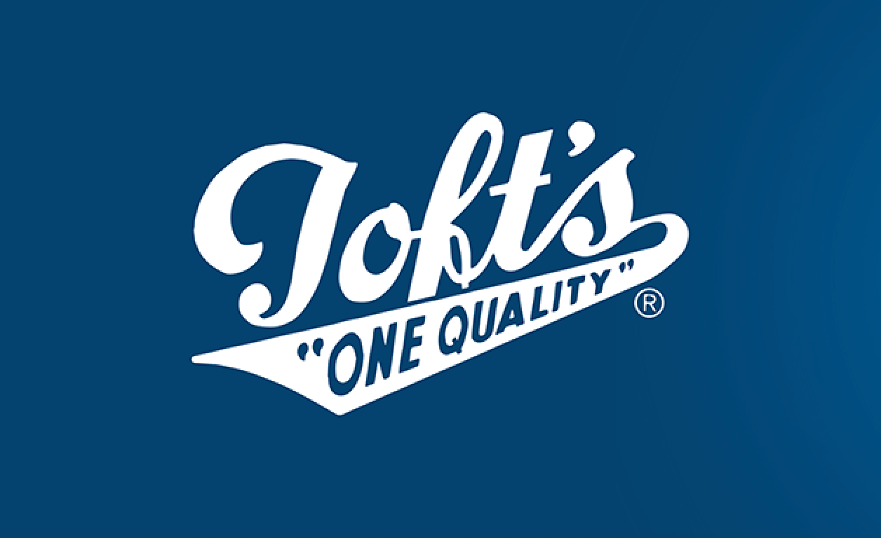
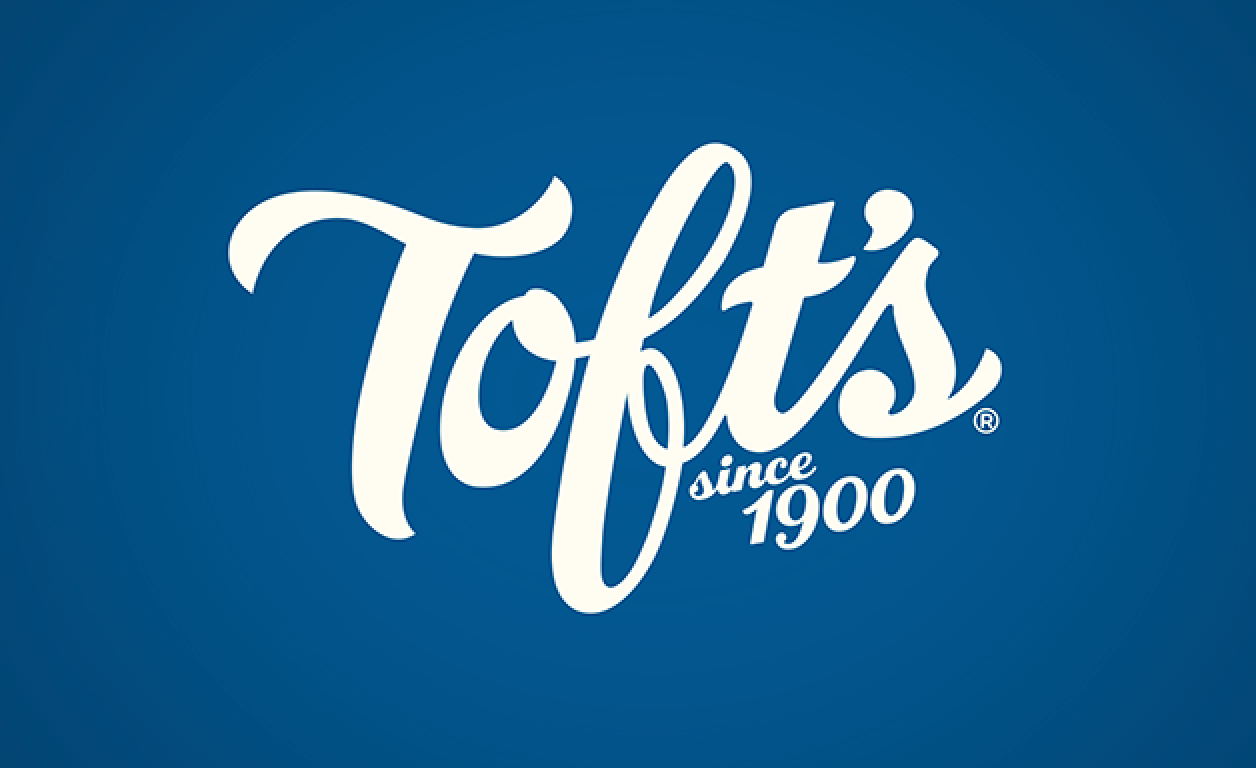
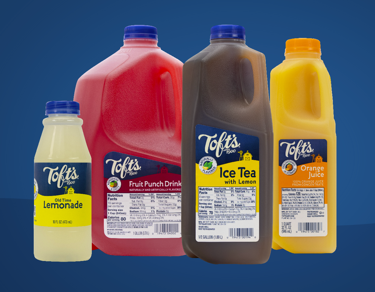
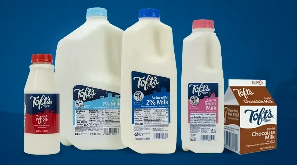
Toft Dairy, an Ohio tradition since 1924, turned to us to modernize their brand when they shifted from traditional cartons to ‘sqround’ packaging. Initially, they sought a quick reformat, but after a few meetings, we saw an opportunity to refresh their image for broader retail appeal. Together, we crafted a modern script logo honoring their heritage, introduced a family-focused packaging system, unified by ‘Toft’s blue’ and vibrant colors that capture their personality. The result? Record-breaking launch numbers and expansion into new retailers, positioning Toft for national growth.
Results
- Record-breaking sales across multiple retailers
- A 250% sales record for new product
- Growing demand for new products
- Expanded shelf space in more locations
What We Did
Brand Identity | Brand Architecture | Packaging | Strategy | Copywriting | Web
more work
Let's talk about you
Have questions or need to get started?
Send us a note. We're ready to go!